
Can we talk about the design of payment terminals for a second. Yes, I am talking about that piece of technology, been around for a while, that allows you to swipe your credit cards and, if you’re lucky, offers contactless payment.
Today I was at Target to pick up a few items and as I was checking out I swiped my card, like I have done thousands of times. But the lack of thoughtful intuitive design that has gone into the interface design of these devices NEVER ceases to amaze me. I literally had to spend extra seconds to look at, read, process, and select an answer to 3-4 questions before I could leave. You may think I am being ridiculous and maybe I am, but the whole reason these terminals exist is to make check out quick and painless, right? Wrong (at least today that’s how I felt).
“Please swipe your card?”
“Credit or Debit?”
– Debit
“Please enter your pin.”
-****. Enter.
“Would you like any cash back? If so, how much?
– No cash back.
“Do you approve the amount $XX.XX for this transaction?”
– Yes
……
– Finally, receipt prints.
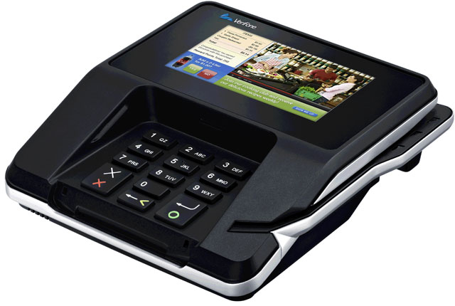
This is the current state of our payment systems today. Thankfully Apple Pay and Android Pay are changing that with quick 1-2 step transactions. BUT, most businesses’ have not updated their payment terminals yet. The length of the transaction is not the only issue at hand. As we have been taught subconsciously through so many other systems out there, certain colors usually identify certain things. In the case of green and red, a few things come to mind: Christmas, traffic lights, Stop and Go, etc. So you would think that when an interface contains buttons that are colored to offer some intuition that they would follow these principles.
This is not the case with the Verifone software that is used in the terminals at Target. Instead, red was used inappropriately causing me to not only have to see the color of the button but also read it and take time to process. This is not well thought out design. If you do not mean to offer a negative (Stop) and positive (Go) option when a question is asked, you should use colors that do not have other connotations in a similar context. This was my design rant/frustration for the day.
end.
